
Designing Haerfest: A Seattle Restaurant Built Around the Chef’s Counter
Designing a contemporary restaurant for a well-known Seattle restaurateur, where a minimalist material palette, open kitchen, and flexible event programming had to coexist without any of them feeling compromised.
The brief for Haerfest was, in certain respects, the easiest kind to receive: our client - a well-known Seattle restaurateur, wanted a room that stayed out of its own way. The food should be the thing people notice. The architecture should support that without announcing itself.
That kind of restraint is harder to execute than it sounds. Minimalism in a restaurant context isn't the absence of decisions; it's the discipline to make fewer of them, and to make each one count.
The Open Kitchen as Organizing Logic
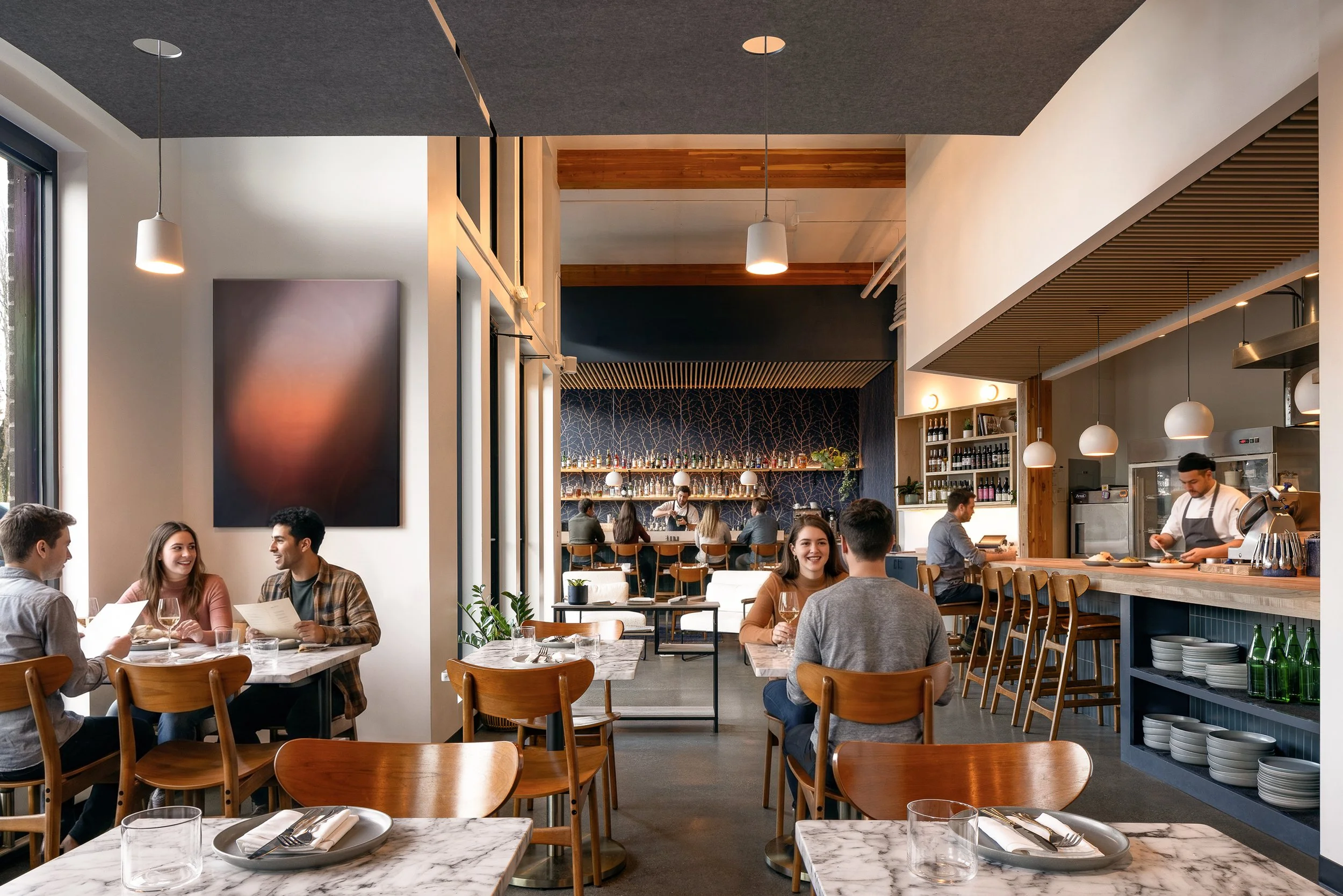
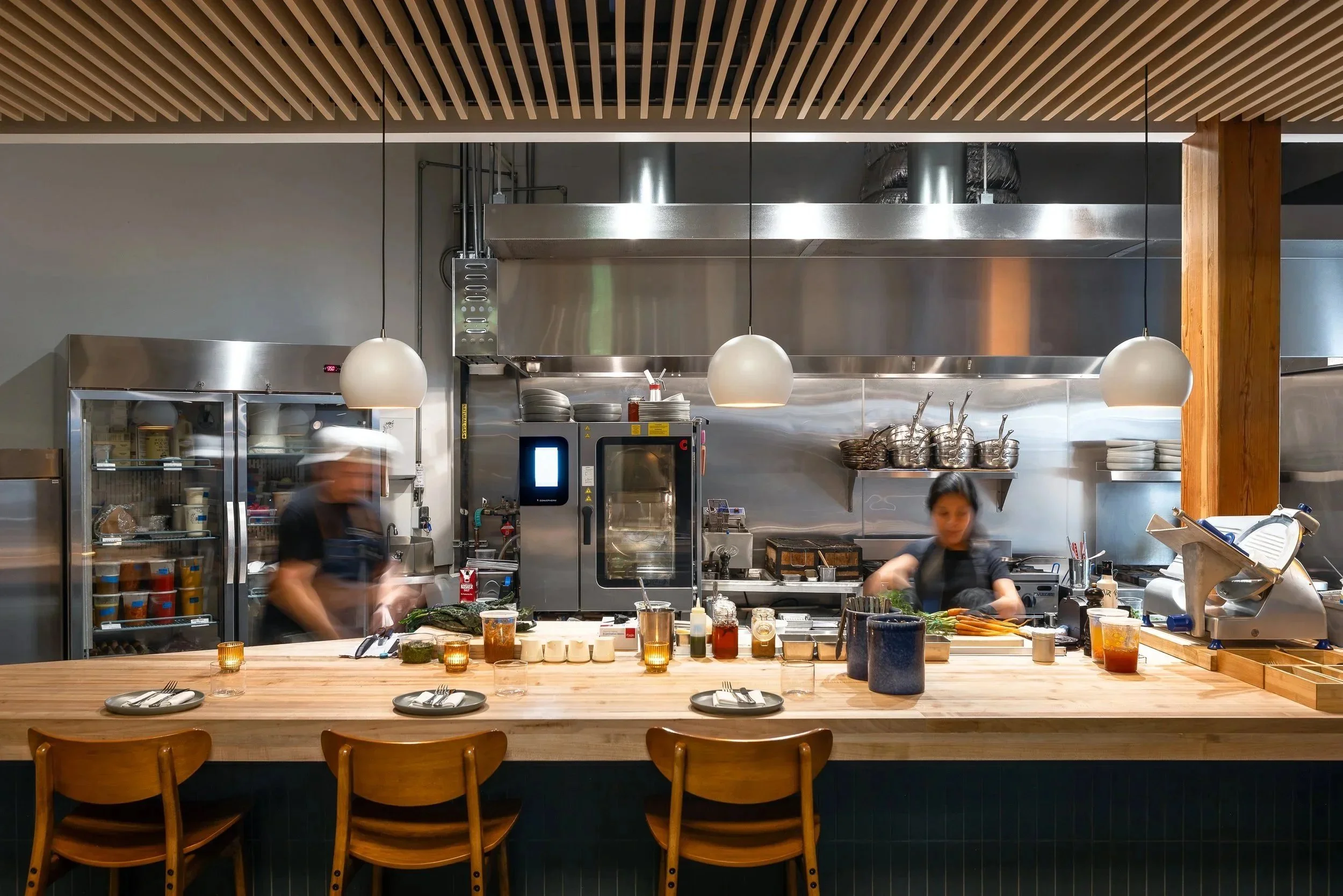
The floor plan begins with a single client priority: the chef needs an unobstructed sightline to every table. This is partly a quality-of-service concern - a chef who can see the room can read it - and partly a philosophical one. The open kitchen isn't a performance element here, a theatrical gesture toward authenticity. It's a functional requirement that then shapes everything else.
Once you commit to an open kitchen with full sight lines, the room's circulation, seating zones, and bar placement follow from that logic rather than from convention. The chef's counter sits at the intersection of kitchen and dining floor, reinforcing the connection between production and service. The private dining room - a client requirement for event programming — is positioned where it can be genuinely separated when needed without fracturing the floor plan during normal service.
Dividing Space Without Dividing the Room
Full-height white oak screen walls divide the dining area into intimate sections. This is worth dwelling on for a moment, because it's doing more work than it appears to. A conventional interior approach would use half-walls, banquette backs, or ceiling drops to create zone differentiation. Screen walls in white oak accomplish the same thing - they give diners a sense of enclosure and privacy - while maintaining visual continuity and allowing light to move through the space. The room reads as one cohesive environment even as it accommodates 45 distinct seating configurations.
The material choice matters, too. White oak is warm without being precious, durable without feeling institutional. It ages well under hospitality conditions. In a space where everything else is held to a near-neutral palette, it's the primary tactile element.
Where the Warmth Lives
Low wood slat ceilings anchor the bar, the banquettes, and the chef's counter - the three zones where guests spend the most time, and where the design needs to deliver the most ambient warmth. The effect is deliberate: the ceiling plane descends over the places where people linger.
The one chromatic gesture in the room is deep blue: wallpaper, tile, upholstery. It appears at each of the distinct zones, connecting them without homogenizing them. In a room that's otherwise quiet, the blue marks each zone without flattening the differences between them.
Two Modes: Dining Room and Event Venue
Restaurant clients increasingly ask for this: a space that functions as a neighborhood dining room six nights a week and a private event venue on the seventh. These are not naturally compatible briefs. The everyday restaurant rewards spontaneity and turnover; the private event venue rewards exclusivity and a sense of occasion. Getting both in the same room requires planning the space so that neither mode feels like a compromise.
At Haerfest, the private dining room handles the separation when it's needed. The bar and chef's counter give the main floor enough programmatic variety that it reads as complete on its own. The materiality and lighting are calibrated to work across both modes without requiring a full reset between them.
Project Information
Location: Seattle, WA (Fremont neighborhood)
Type: Restaurant / Hospitality
Status: Complete, 2024
Architecture: Field Report Architecture
Contractor: Choice CG
Photography: Sean Airhart
For a look at how similar kitchen-visibility logic plays out at resort scale, see our work on GH Pizzeria and GH Tavern at Suncadia.